![IA TBE logo transparent back.png]](https://independentaudit-7418567.hs-sites.com/hs-fs/hubfs/IA%20TBE%20logo%20transparent%20back.png?height=44&name=IA%20TBE%20logo%20transparent%20back.png)
Thinking Board uses averages to generate some of the charts available within the reporting suite. The reports that use averages are the “Overview” , and “Heatmaps”:
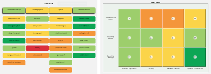
How the averages are calculated
To calculate the score, each rating for a question is given a number. The most negative rating is always assigned the number 1, for example:
- Not well enough
- = Ok – but could do better
- = This works well
To calculate the average, the numbers for all of the ratings given to a question are added up, then divided by the number of respondents who answered the question. This gives the average score for that question.
Averages for Topics are calculated by taking a mean average of all questions in the topic.
Explanation of Chart Colours
Over the course of many years of analysing Thinking Board results Independent Audit have adapted the charts to make sure any issues from the responses are drawn out effectively. For this reason the scores associated with each colour are weighted towards the more negative end.
For example in a questionnaire with three scores, if at least half of the respondents gave the lowest possible score then this would result in an average of 2 or lower, and would therefore show as red on the chart. This ensures that any significant pockets of low scores are not obscured by the average.
This also means that if all respondents to a question gave the middle rating for a question then it would also give an average of 2, and therefore show red on the chart. We believe this logic still holds true because if 100% of a board respond indicating that there is room for improvement in a certain area then this is something the Board should look at.
Colour Boundaries for a 3 Score Question
Where a scores falls on the boundary between two colours, the chart will always display the more negative colour. For example a score of 2 would show as red on the chart. We find this helps draw out the areas with the lower scores more effectively.
